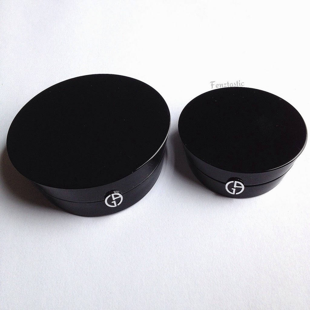
Yves Saint Laurent. YSL. Three simple letters that just scream luxury both in the fashion front and in the beauty department. Personally, YSL hasn't released too many products in the last couple of years that have impressed me. However, give me sleek and posh packaging and promises of looking like a walking filter, and that can easily be changed.
Showing posts with label eyeshadow. Show all posts
Tuesday, July 7, 2015
Friday, August 22, 2014
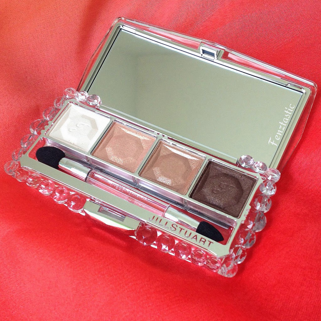
Jill Stuart Velvet Crystal Eyes 01 Nudy Venus
There was a time when I felt the need to own every single Jill Stuart quad she has ever released. Now that I'm older (and, hopefully, wiser), I find it an impractical goal. I can't pull off shadows chock full of glitter on a daily basis, and her shadows are known to pack quite the shimmer and glitter particles, while still being slightly on the sheer side at times. Don't get me wrong, they're still gorgeous and perfect for nights out -- not so much for an everyday conservative work place.
That said, Jill Stuart recently launched a Velvet Crystal Eyes line, which is such a nice departure from her former Jewel Crystal Eyes and Illuminance Eyes quads. The shadows are more pigmented (compared to other Japanese eyeshadows) and just overall smoother in texture. The best part of it all? She's finally incorporated satin finish shadows in the midst of shimmery shades in these, as opposed to her older quads, where all four shades contained glitter. It's still difficult to achieve a full look look with the current layout, methinks, but it's doable if need be.
Wanting to play it safe, I stuck to my comfort zone of neutrals and opted for 01 Nudy Venus. The colors are straightforward with one satin brow bone highlight/all over base shade, two shimmery lid shade options, and one shimmery shade perfect for lining or the outer-V. The eye looks one can come up with with this palette alone is limited, but it has all the shades I need for an everyday, quick, and fuss-free look. I previously used the included applicators to apply the shadows as they ran more sheerly, but with the new formula, the applicators are rather useless.
(From top to bottom):
-Shade 1: Shimmery dark chocolate brown with a handful of glitter particles that do not translate when applied
-Shade 2: Shimmery, metallic beige-champagne that is probably the smoothest shade of the four
-Shade 3: Shimmery, slightly metallic pink-champagne
-Shade 4: Satin ivory white that -- more or less -- disappears on my NC20ish skin
With the new quads come a couple of changes. The first and most noticeable is the design of the palette. I personally find it more simple in design, though bulkier and certainly heavier than her other quads. Now, Jill Stuart listed her new quad as containing 8 grams of product, as opposed to the former 6 grams. The size of the pans look the same to me, and the new palettes seem to actually contain less product to me, so I'm not sure where exactly the weight discrepancy comes from.
Quality and performance-wise, I'm happy to say that these stack up to Jill Stuart's past offerings. With primer, these stay put for at least a good ten hours. Without primer, I suspect they still run on the sheer side. The shadows themselves do have the traditional floral scent that is common in her products, so do make note of that if you are one who are sensitive to fragrances (in eyeshadows, especially.)
I couldn't be any happier with the launch of the Velvet Crystal Eyes line, and I do intend on picking up her limited edition palettes, as the color schemes are more unique than the current permanent range. The price of a palette ranges anywhere from $55-$70, depending on the website you order from.
Saturday, August 2, 2014
Cle De Peau Eye Color Quad in #305 Satin Moon
Cle De Peau's newly reformulated line of eyeshadow quads has got to be one of the most highly anticipated launches for fall 2014. I mean, how could it not be? Just look at those shades!
CDP released eight palettes that will be part of the permanent range to replace the former quads, and I couldn't be any happier. The older quads, while creamy in texture, was a bit ho hum in the color selections. None of the color combinations really called out to me, and the shadows themselves were more on the sheer side as well.
The new formula, however, is amazing -- to say the least. The quads, dare I say, easily rival Tom Ford's quads. Yes, you read that right. Tom Ford shadows translate much, much better on the eyes than they swatch at times. These CDP shadows swatch beautifully and they wear just as nicely. In terms of texture, I do find them smoother than some of TF's shadows. However, they both blend effortlessly and with great lasting power -- easily 10 hours with no fading nor creasing when applied over eyeshadow primer!
From the eight new quads, #305 Satin Moon was the one that really caught my attention. "Satin Moon" is a bit of a misnomer if you ask me, because all of the shades are anything but satin in finish. In fact, all four shades are shimmery in nature.
I cannot fault this palette in any way. If I were to nitpick, I'd say that Shade 4 is a bit on the drier side. It's also the only shade that's chock full of noticeable (yet finely finely milled) multi-colored glitter. Shades 1-3, however, are just phenomenal -- a dream to work with! I cannot say that the other quads are of the same caliber, as I didn't get the chance to swatch all eight of them, but the ones I did swatch, I loved. In fact, #303 Baby Universe is conveniently sitting in my cart as we speak.
My biggest gripe with CDP (and the main reason why I don't own any other CDP products aside from this quad) is that the palette ($55) and the compact ($25) are sold separately. It's a concept I could never fully wrap my head around, aside from profit-making from the company's standpoint. The refill might fit inside a Z-palette, but if you're already taking the CDP route, you might as well go all the way and just bite the bullet on an empty compact. That said, the older compacts are not compatible with these new quads.
I'm one of those folks who likes to use all of the colors in a palette for eye looks. To be honest, this palette is not complete on its own. It lacks a matte transition color and a solid brow bone highlight. However, for the sake of this review and my wanting to incorporate all four shades in one look, this is my favorite way to wear this palette. To make it more cohesive, I did reach for two additional Urban Decay shadows (both of which are easily dupable.)
- Urban Decay Skimp as brow bone highlight (Any preferred highlight shade will do.)
- Benefit B-day suit as a base all over the lid (optional)
- Shade 1 on the inner 1/3 of upper lid and inner corner
- Shade 2 on the outer 2/3 of upper lid
- Shade 4 on the outer V and along the top lash line
- Urban Decay Naked in the crease (MAC Kid or Wedge are good alternatives)
- Shade 3 along the bottom lash line
- Too Faced Perfect Eyes black liner to tightline
- Givenchy Noir Couture Waterproof mascara on top and bottom lashes
All eight quads are now available everywhere Cle De Peau color cosmetics is sold. I strongly suggest running to your closest counter for a swatch-fest. You can thank me later when you come home with a quad or two, although I'm not responsible for your thinning wallet.
Labels:
cle de peau,
eyeshadow,
permanent,
quad,
satin moon
Saturday, July 5, 2014
Marc Jacobs The Siren
(Summer 2014)
Despite being a neutrals gal at heart, I'm always on the lookout for that one perfect colorful palette. You know, the only palette that will satisfy all of my colorful shades needs. Supposedly. I passed on the Urban Decay Electric, because to be honest, the fact that not all of the colors are safe around the eye area scared me a bit. Okay, a lot.
So when I saw that Marc Jacobs had released The Siren palette, I couldn't help but place an order. Sleek packaging with seven beautiful colors? Sold.
First things first, the goods. I have always been a fan of Marc Jacobs' packaging, especially with his 7-pan eyeshadow palettes. This was no exception, and the glossy white packaging really complemented my glossy black Starlet palette -- quite possibly the only palette from his permanent line that I can wholeheartedly recommend. They are super slim and compact in nature, and they don't attract fingerprints in the same manner as NARS. I had heard that The Siren was designed to mimic the keys to a piano, but I'll let you be the judge of that.
1. Slightly shimmery white: Easily my least favorite shadow, this not only swatches chalkily but applies patchily too.
2. Slightly shimmery burgundy red: Like the white, this is on the drier side as far as shadows go but applies slightly better.
3. Shimmery, metallic copper bronze: My favorite shade of the seven, this is beautiful and a dream to work with. Highly pigmented and very blendable!
4. Shimmery, metallic gold: My second least favorite shade, this reminds me a lot of MAC lustre formula eyeshadows (translate: glitter-laden with poor pigmentation.)
5. Shimmery aquamarine: Another disappointment of a shade, this needed a white base in order for it to show up true to color on the eyes.
6. Slightly shimmery blue: Very dry in nature and nowhere as vibrant as the color seen in the pan.
7. Shimmery dark teal: One of the better performers, this actually applies well and blends effortlessly.
As you can tell, chalky and dry seems to be the common theme when it comes to the shadows of this palette. With only two stand out, note-worthy shades, I cannot recommend snatching The Siren -- which is a shame, since it is pretty to look at. For the luxury brand and price tag of Marc Jacobs, the performance should not be questionable.
On the topic of luxury, might I also add that the included sponge tip applicator is absolutely flimsy and useless? If Dior includes two sponge tip double-ended(!!) applicators with its quints, the least MJ could do is make it double-ended, right? Or not include it at all, because quite frankly, it's insulting for those of us who actually reach for such applicators from time to time.
I had high hopes for (and wanted to like) this palette, but truth be told, it fell short of my expectations. A friend and I were just talking about how there might possibly be different batches of The Siren, since some palettes actually swatch better than others. That might be the case, and if you're one who's willing to take the risk, you might be able to snatch a better performing septet of a palette. This currently retails for $59 at Sephora -- in stores and online. Despite it being dubbed as "Limited Edition", I really cannot see this palette selling out. If anything, I'm half expecting it to show up under Sephora's sale section within the next few weeks.
Labels:
eyeshadow,
Limited Edition,
marc jacobs,
palette,
summer 2014,
the siren
Saturday, June 21, 2014
Giorgio Armani Eyes to Kill Macro-Color 09 Tadzio
If there is one shade I just can't get enough of in my stash of eyeshadows, it would be the color taupe, defined as a "gray with a tinge of brown." Personally, I think it's a chameleon of a shade, especially given the different undertones. Either way, I feel the need to own every single taupe shadow ever released, whether it be cool-toned, warm-toned, neutral-toned, what have you.
*cues entrance music to my latest addition*... Giorgio Armani Eyes to Kill Macro-Color in #9 Tadzio!
I don't know what Armani did with this new and permanent ETK formula, but it takes the word 'buttery' to a whole new level. It is noticeably creamy, smooth, and pigmented upon first application but without the fallout that goes along with such textured eyeshadows from other lines.
What I love so much about this eyeshadow (apart from the reasons I listed previously) is how fool-proof Tadzio is for those mornings when I need to be out of the house in less than five minutes. With the shimmery, metallic taupe padded onto my lids and blended into my crease, it looked like I had actually put some effort into my eye look by at least incorporating three shadows.
At first glance, it did look like a shadow I had multiple dupes of in my collection. However, I am pleased to say that it is unique in its own ways. While some seemingly neutral-toned taupes actually pull warmer or cooler on the lids/skin, Tadzio stays true to its neutral-toned nature. I have also pulled out some taupes for comparison purposes. As you can see, Cargo Yukon and Chanel Gri Gri both lean cooler, whereas the slightly purplish undertones show through with Inglot 402 and MAC Satin Taupe.
If you are just as big of a taupe fan as I am, Tadzio is a definite must! From the shade to the packaging, I do think that Armani really outdid itself with its new release of eyeshadow singles. The eyeshadows are practically packaged as mini versions of the limited edition highlighters and the cheek fabric blushers. Beyond adorable, if you ask me!
Each eyeshadow runs $32/pop wherever Armani makeup is sold, which is quite the investment -- especially for a single containing 0.14 oz of product. However, if you are a firm believer of quality taking precedence over quantity, I cannot stress giving Tadzio (or any other shades from this range, actually) a go. I promise you won't be disappointed with whichever shade(s) you decide on!
Labels:
eyes to kill,
eyeshadow,
giorgio armani,
permanent,
tadzio
Saturday, May 24, 2014
Chanel Les 4 Ombres: Tisse Venitien and Tisse Gabrielle
I will be the first to admit that I was never the biggest fan of the regular Chanel eyeshadow quads. Either the pigmentation is lacking or the shadows just apply patchily. The former baked quads were worse. Forget picking up any color when applied dry. All that changed when I saw swatches of the newly reformulated baked quads, called the Les 4 Ombres, circulating first on British beauty blogs and later on Instagram.
These will be coming to the states in July, retailing $61 a pop. There will be eight permanent quads, each with its own color scheme. Whether or not these will completely replace the current quads is yet to be determined. However, I am not one to object if they do, as the new Les 4 Ombres formula really blows the former out of the water. Keep in mind that these are only meant to be worn dry, despite them being a baked formula!
To get a feel for the new quads, I started out with two: Tisse Venitien and Tisse Gabrielle.
232: Tisse Venitien
Many of you are probably shocked by my choice but Lord knows the last thing I needed is another neutrals quad. Green eyeshadows are a bit tricky, as some undertones can make me look sallow, and others just turn into unflattering blue-gray shades on my lids. However, a friend of mine posted a wearable, work-appropriate eye look with Tisse Venitien that completely sold me on this particular quad -- which is slightly reminiscent of the current Lilium quad actually.
In clockwise order starting with the top left shade:
-Shimmery forest green: most versatile color of the four as it can work as an all-over lid shade, a liner, etc.
-Satin pale pink: my least favorite of the bunch as it disappears on my skin, however, it does make for a great blending color or browbone highlight
-Shimmery blackened green: another versatile shade that is great in the crease, on the lid, or even outer V
-Metallic green taupe: my favorite color in this quad as it is very multi-dimensional and complex depending on the lighting
Personally, my favorite way to wear this is forest green on the lids and lower lash line, metallic green taupe dabbed on the center of the lids, with the blackened green in the crease blended out with the pale pink.
208: Tisse Gabrielle
Now this is more in my realm of shades. I later discovered that the reason why I was so drawn to this palette is because it resembled the only Chanel quad I ever kept for myself: Prelude. To be honest, I don't wear darker, cool-toned, taupey-gray colors as much as I should, but whenever I do, I wonder why I don't wear them more often as they really make my brown eyes pop.
Clockwise order starting with the top left shade:
-Shimmery, slightly metallic, blackened gray: great lid color for a gray smoky eye or to darkened the outer V
-Metallic ivory white: perfect for inner corner highlight or to layer over the other colors in the quad to lighten the shades!
-Shimmery grayish brown: my least favorite color in this quad as this doesn't blend too well when popped in the crease, however, it makes a great liner or lid color
-Shimmery, borderline metallic, purplish taupe: my favorite color due to its smoothness and multi-dimensional nature to use all over the lid
With the metallic ivory white shade, the number of looks one can come up with is endless with Tisse Gabrielle. I particularly enjoy wearing the purplish taupe on the lid, grayish brown in the crease, blackened gray in the outer V, and ivory white in the inner corner to highlight.
While I would say that the quality of these new quads has greatly improved compared to the older quads, there are still some pros and cons I would like to point out.
Pros:
-The shadows are very pigmented and blendable for the most part.
-Great lasting power -- easily 10+ hours on primed lids -- with no signs of creasing nor fading.
-No fall out whatsoever, even with the darker shades!
-More product (2g) compared to the former baked quads (1.2g)
Cons:
-No mattes in both quads means needing to incorporate additional eyeshadows/palettes for a more cohesive look.
-Tendency to crease upon contact with water or sweat, but that is expected with baked formulas in general.
As you can see, the pros far outweigh the cons with the new Les 4 Ombres! To say that I am impressed with how these perform would be quite an understatement. I can see myself picking up additional quads when these make their way stateside, especially the all-neutrals Tisse Rivoli (like we didn't see that one coming!) and Tisse Vendome, as I have a soft spot for coral eyeshadows.
If, however, you are not one to wait until July to get your hands on these palettes, Izzy's Beauty Shoppe now has all eight quads available!
Labels:
Chanel,
eyeshadow,
les 4 ombres,
quad,
tisse gabrielle,
tisse venitien
Subscribe to:
Posts (Atom)